Thursday 22 June 2017

Theory continued

Above is the plan for the thermal baths by Peter Zumthor, chosen as my precedent due to its emphasis on simple geometry and open circulation. The black solid line is primary circulation, with secondary circulation shown by the dotted line. Each area is also assigned either private, public or semi private, as specified by the legend bottom right.

I also attempted to complete a quick adjacency diagram, but only had time to do a small word based evaluation.
Adjacency Diagram


Lecture Theatre
Studio Spaces
Offices for Academic Staff
Offices for General Staff
Workshop
Computer Labs
Gallery
Research Space for Academic Staff
Meeting Rooms for Staff
Meeting Rooms for Students
Library
1     1-       Library, Meeting room for students, gallery
2     2-        Lecture theatre, studio, workshop, computer lab
3     3-       Offices academic, offices general, meeting room for staff , research space


Circulation between the three should have area (2) in the middle between the (3) and (4) as it is the area where staff and students most regularly meet. The rooms that can be the most isolated are the staff research spaces and general offices, the most accessible would be the lecture theatre and studio, as well as the library, as these are heavily frequented. 


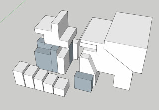
 I attempted to translate the plan to a section and use this to create my rooms, but as you can see I did not simplify the plan enough before attempting to merge them, and the resulting rooms weren't usable.


Moving Elements

 For my moving parts I chose to create a moving external 'blind' of sorts, as well as a cover that extends to shade an area of the garden.

The blinds are seen in the first two images on the right, the alternating posts that are currently raised would slide down and block out almost all of the light coming into the room, the longer posts are static to constantly provide some shade from the lgiht and to serve as a railing for the garden above.

(unfortunately I could not work out how to animate the objects and make them move, I spent all night trying, sorry)
The second moving part is a cover that extends beyond the student meeting rooms to provide shelter for that section of the garden, so students can enjoy being outdoors in all situations.

Rooms

 On the top floor are the student meeting rooms. Situated above the library, the meeting rooms are placed between the library and the relaxing gardens, an ideal place to allow for laid back conversations or group study sessions.
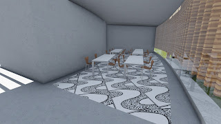
 The library is the largest space, and hosts large bookshelves as well as an assortment of tables and chairs to read and study on. The open plan library is a modern take on the conventions and is an integration of my theory as it efficiently combines the purpose to the space.
 In between the two 'wings' of the bridge is a relaxation zone, housing a small atrium and a walk out balcony the hosts a grassy lawn to enjoy a break on.
 On the bottom floor is the gallery, the open to public location and large glass windows is ideal for the space as it allows for the attraction of the public.
 The Studio, workshop and computer lab are all situated above the gallery, and are all situated so a large portion of the wall is the windows to the outside, allowing for a more relaxing work zone. The moving 'blinds' can be used to block out more light if a dark environment is needed
The lecture hall stands at the top of the building, leading up from the work zones below to complete this section of the building as the core learning zone.

 The rather mundane general offices, staff offices and staff meeting rooms, positioned out of the way in the corner of the bottom floor.

Final submission

The exterior of the bridge combines the natural elements of the square house with the simplicity dictated by the theory. Although complex at first glance, the building is comprised of only three core layers placed on top of each other. This arrangement retains the simplicity derived from the core concept, whilst allowing room for innovation and interesting spatial  opportunities.


As a collective whole, the building efficiently solves the needs of all the people who use it, providing a healthy combination of learning spaces and relaxation zones in a simple, free flowing bridge.


Dropbox link:
 https://www.dropbox.com/sh/iip3w43odsri2ts/AAAb6ihAehi6inhiRgCT4S1za?dl=0


Draft Lumion


 The development of my project was fairly smooth, with solutions to issues found relatively easily.

The biggest change that was made was the transition of the lecture hall to the top floor, as seen between these two sets of photos. Initially the computer lab was going to be on the top floor, however I realized that the roof was not high enough on the middle floor to allow for a lecture hall, and thus I changed the model to isolate the lecture hall on the top floor, as seen in the bottom set of images.


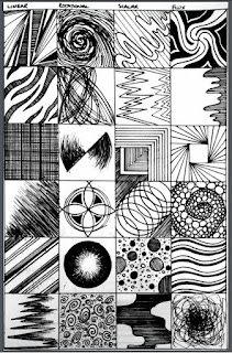
36 Textures


 These three textures were used in the final model, as seen below:


18 Sketch Perspectives


Theory

Conceptual discussion:

The design attempts to solve the issue of over congestion within London by creating a cycling network above railway lines.

This article appeals to me due to my own British heritage, having been to London many times I can personally envision the project and how it will help. I also enjoy the ergonomic and efficient approach, how it is an ingenious solution to a large issue, the basic design also has room for architectural upgrades and development. From the perspective of an engineering student, this design is also appealing due to its focus on problem solving.

Key words:
Congestion
Ergonomic
Efficient
Connection
Segregation
Accessibility
Minimalistic

Combination of words into theory:

Minimalistic architecture derives from efficient solutions to contextual issues, utilizing ergonomic designs to strengthen the connection between site and structure through emphasis on communal use.

Sunday 30 April 2017

Architecture

For my final model, I based my design off my continuous form/monumental axonometric, but i further simplified the geometric shape by utilising a rectangular pyramid. The choice of the pyramid serves multiple purposes;

1. The rectangular base compliments the road and lets the building fit into the urban environment,
2. The shape relates well to the axo. sketch, and
3. The pyramid is crucial to the symbolic relation to the theme technology

To expand on point 3; In Ancient Egypt the pyramids were built as stairways to the heavens and the gods, this symbolic meaning ties into the current progression of technological advancement, as mankind strives to elevate to god-like status through technological advancements.


Textures


For the light to dark textures, i tried to link each one back to the theme of technology, which i felt fit the task of 'light to dark' very well. My view of technology is that it is an omnipotent force that is slowly pervading every aspect of society, which is thus communicated through the building of multiple layers within the textures. As the patterns get repeated and built upon, the texture gets darker and restricted, representing this notion that technology has a vast and restrictive hold over modern society.

The three textures used in my model are placed below, from light on the left to dark on the right. 

Combination Axonometrics


 My combination Axonometrics cover the concepts of:

- Scale/synergistic forms
- Continuous form/Monumental
- Geometric hierarchy/ Micro and Macro

Of the three choices, I decided to go with the second, as i could relate it back to the task of a train station most easily, whilst also keeping a solid foundation from which to design the building. Once again I was pressed for time, and decided not to complete the third flipped view, as the sketch is too complex and would use up too much of my remaining time.


Axonometric sketches


Initially, my axonometric sketches were too plain and not detailed enough to fully explore a concept. My later attempts were more successful, however I have realised many of them are symmetrical, so the flipped view is identical to the normal view.

I have just realized I have lost one scan of a sketch, i did complete 6.